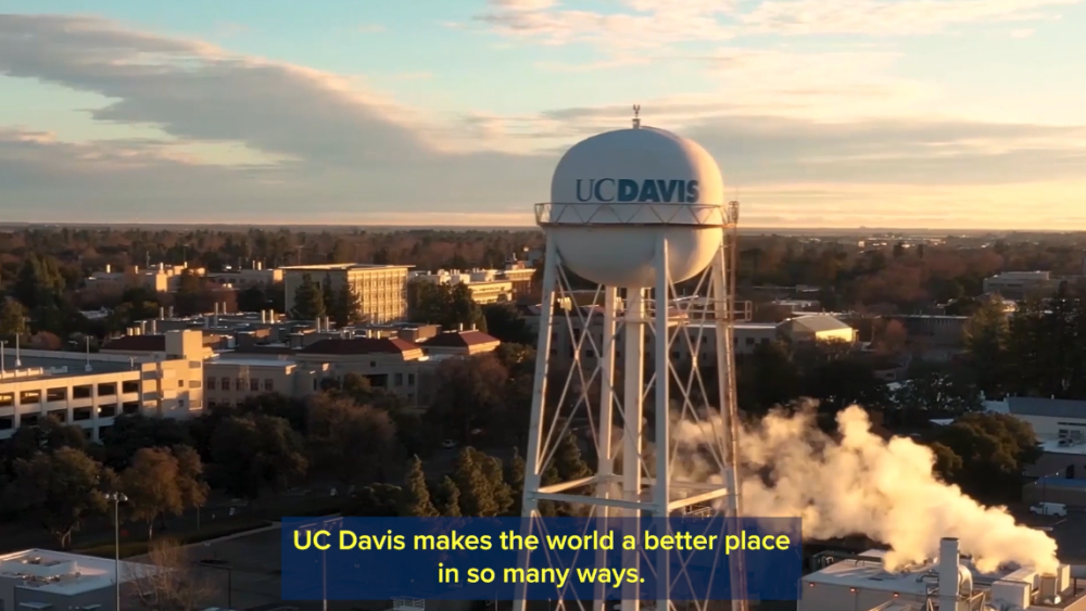
Using text on screen can be a great way to relay additional information to your audience. Keep in mind that video is not the best medium for heavy text. It is best to keep your text on screen brief and simple. If you need a lot of text, you could add a voiceover that matches the on-screen text and use closed captions to make it accessible to screen readers.
It’s also important to make sure your text meets accessibility standards and has a contrast ratio of at least 4.5:1. Consider the smallest screen your text will be seen on, and remember bigger is better. We have provided acceptable UC Davis color combinations and more tools to analyze text contrast in the resources section.

UC Davis Video Graphics
Here you can find a selection of branded UC Davis motion graphics to download and add into your videos.
Text on screen examples:
Captions
Here is an example of our open captions.

Informational text
Place text in an open space on screen where it is easy to read and doesn't obscure important objects in the frame. We suggest leaving text on screen for at least as long as it takes to read through twice.

Lower thirds
Place text so it leaves enough space for captions.
