This collection of illustrations, featuring our campus’s most iconic characters and locations, is the work of renowned artist (and UC Davis alum) Steven Noble, whose distinctive work can be found on the packaging and promotions of many of the world’s most recognizable brands.
Download
These drawings are available for download (and also available as shared assets within the UC Davis Canva for Enterprise design platform). They are intended to enhance communications and reflect the UC Davis brand. They are not to be used in place of unit signatures, nor are they to be connected to signatures to appear as part of a unit mark.
Egghead Illustrations
We commissioned these illustrations as part of a “Year of the Eggheads” celebration. The official celebration ends April 2025, but Egghead pride will live on indefinitely. See the Year of the Eggheads Celebration Assets and Guidelines page for usage dos and don’ts.
Three Sets: Standard, Inverted and Color
The Branding Illustrations library is divided into three folders based on the ways they should be used.
Standard
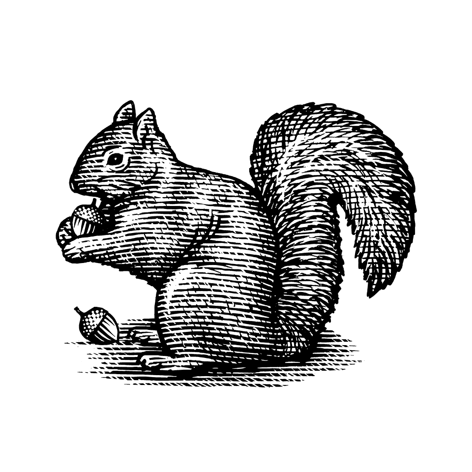
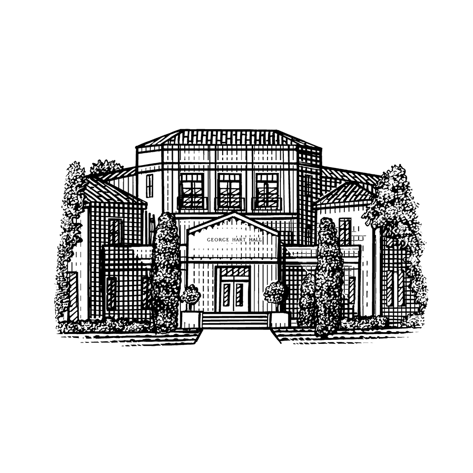
Contains the full set of illustrations for use only where the illustration is darker than the surrounding background.

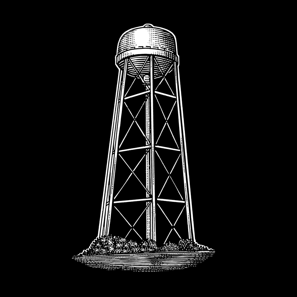
Inverted
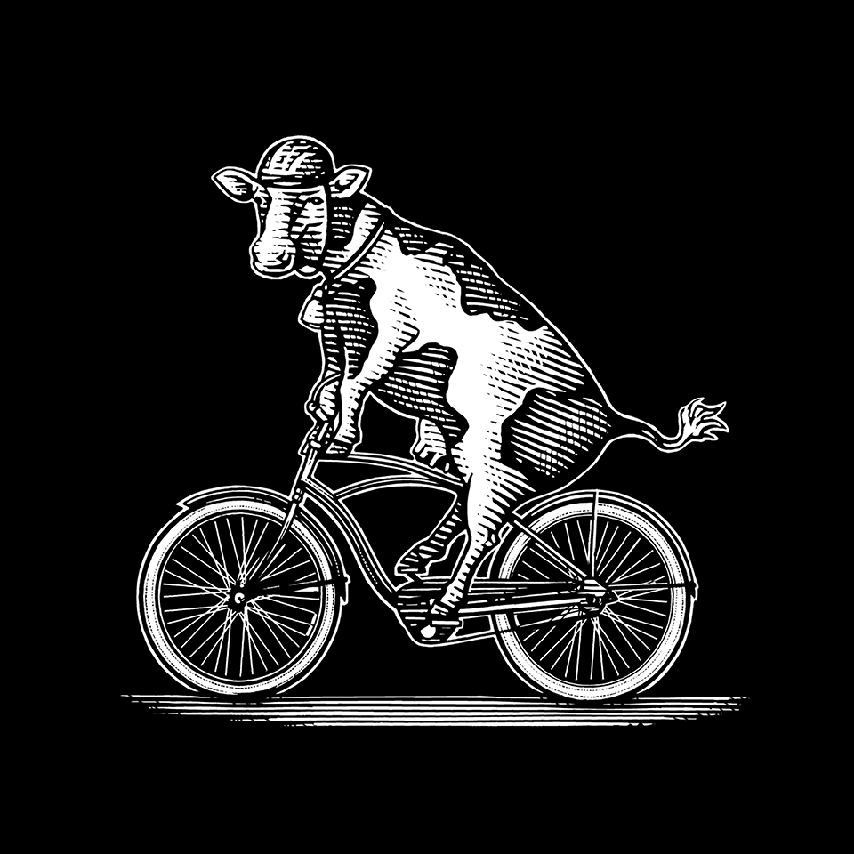
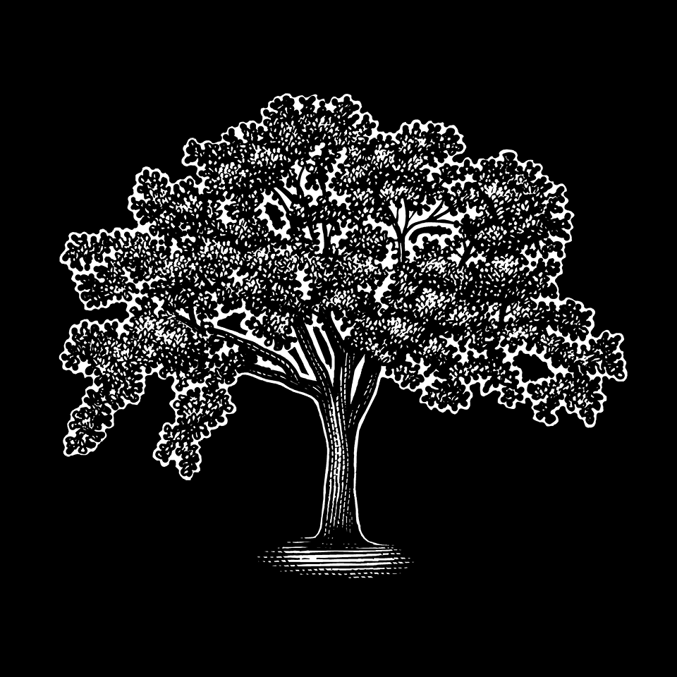
Contains a selected set for cases where the illustration is lighter than the surrounding background. If an illustration in this collection also has a version in the standard collection, use this version only in inverted situations. (See the “How To” section below for further usage guidance.)
Color
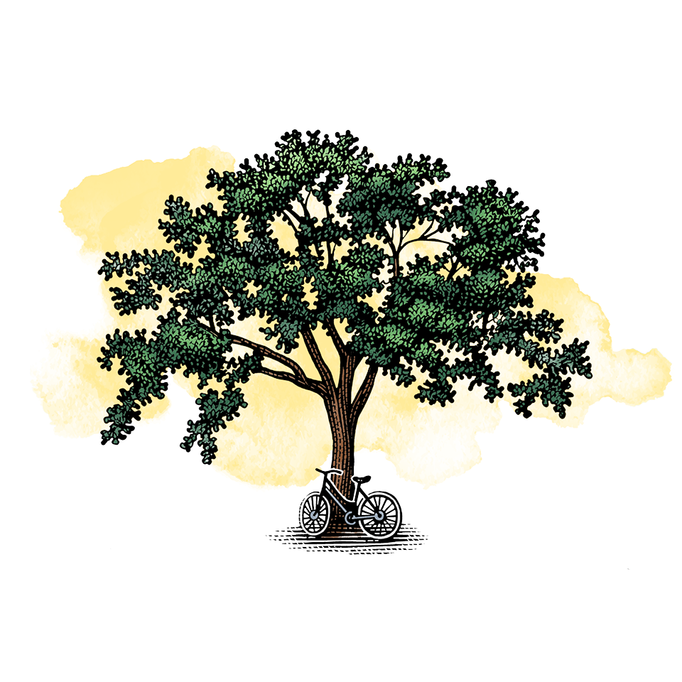
Contains a selected set using watercolor brush fills from the brand color palette.


The Landscape Series

The Landscape Series (available in black & white and in color) incorporates the Davis campus’ most recognizable sites. Please note the collection does not reflect actual campus geography. It’s more like a collage. A college collage.
Section 1 = Mrak, Lake Spafford, Arboretum Waterway
Section 2 = Arboretum Waterway, North Hall, Water Tower, Phone Booth
Section 3 = Phone Booth, Double Decker Bus, Memorial Union, Wall sign
Section 4 = Wall Sign and Walkway
Need something narrower than the whole landscape? It is also available in simple subdivisions (Sections 1, 2, 3 and 4) and also in contiguous sections (1-2,1-2-3, 2-3, 2-3-4, and 3-4).
Use them only in the "standard" way detailed below, never inverted.
How To Use Standard vs. Inverted Illustrations
Ex. 1 (Standard)

Use the standard illustration when the illustration's value is darker than the background.
Ex. 2 (Inverted, incorrect)

Here the colors from Example 1 are merely inverted, causing an unintended “X-ray effect” where normally light elements, such as the bus windows, have turned dark, and vice versa.
Ex. 3 (Inverted, correct)

Instead, use the inverted version when the illustration's value is lighter than the background. Note this is a different drawing from the standard version.
